Guillon Bold Italic
Guillon Bold Italic — 30 pt
The Montreal type with the international style
Guillon Bold Italic — 20 pt
Our starting point is human. This particular human is from France and lives in Montreal, a city with a future. He studies architecture at McGill. He proves to be really modern: he creates a chair by stretching parachute cords over a frame made from the wood of old skis.
Guillon Bold Italic — 15 pt
But he who believes in humanity does not rest on his laurels. He is not satisfied with just doing a good job. With two polymath colleagues, he starts a company that does every kind of design, which is a very international thing to do. They are just in time, because it will soon be 1967, and the World Fair is coming up. After work, our man dreams of taking the metro—quick, light and comfortable—all the way to everywhere. Direction: Montreality; last stop: tomorrow!
Guillon Bold Italic — 13 pt
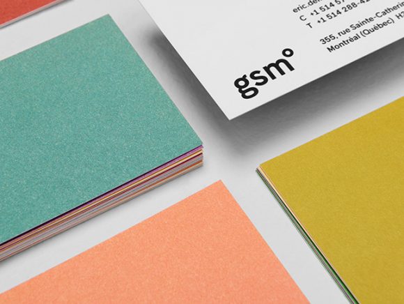
Guillon, a Montreal-minded sans serif influenced by the Swiss international style, is named in honour of designer Jacques Guillon. It was created for the rebranding of GSM Project. After designing the Cord Chair (1953), Mr. Guillon lent his initial to GSM Project, the multidisciplinary design agency he started with Morley Smith and Laurent Marquart. Right from the beginning, GSM has breathed a modernist, international life into Montreality, with notable contributions to Expo 67, the design of the Montreal Metro, and the furnishings of the head office of Alcan aluminium corporation. — Daniel Canty


